This academic year has been full of new features, and one of them is the big change of the platform with the spectacular design. We know that every change implies an adaptation behind, that is why today we bring you this post explaining all the new features that you will see from now on in Additio, and how to use these new features to get the most out of them.
THE NEW MAIN MENU

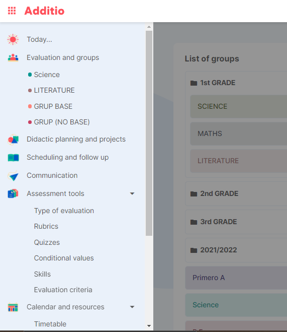
Let’s start with the first step of all in Additio, the new main menu. You will see that now that the options in this section have changed. To start managing your courses, you will be able to find all your class groups from the option “Assessment and groups“.
As a new feature of this new version, you will find the option to create “Didactic Planning and Projects” where you will be able to develop competential activities connected to the scheduling of your classes.
“Scheduling and follow up“, where you will be able to organise your class sessions, configure timetables, have a more detailed view of the units to be worked on, etc.
The Communication section for those who use the Edvoice platform to communicate with families and students at the school and keep track of monitoring, both inside and outside the classroom.
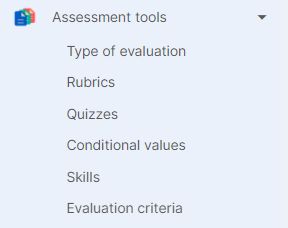
The following options can be found in the drop-down list of evaluation instruments:

- Types of evaluation: so you can create your own types of marks, being able to configure your gradebook to the maximum, and adapting it to your evaluation needs. You will see that it will also allow you to edit those notes that are already created by default from Additio.
- Rubrics: the great ally of teachers to assess students. Remember that you can always find many more from our rubric bank “Edrubrics”.
- Quizzes: another star element to qualify the student’s learning during the course. This is the creation of tests with questions that you can create yourself, with different configuration options, answers to write, add images to make it more visual, etc.
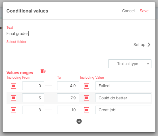
- Conditional values: where you can create your own types of conditional values, establishing intervals where you can apply text or icons

Then you will find a second drop-down menu under the “Calendar and resources” option with the following options inside: Timetable, where you will have an overview of the week, with the classes you have scheduled, events, meetings, etc. the calendar, with a week and month view option, the notes section, serving as internal notes for the teacher, where you can write down comments you need to have at hand, reminders, meetings, etc. and finally, we have the resources section, where we can link all kinds of documents to be able to work with them in class.
HOW DOES THE NEW DESIGN WORK INSIDE THE GROUP CLASS?
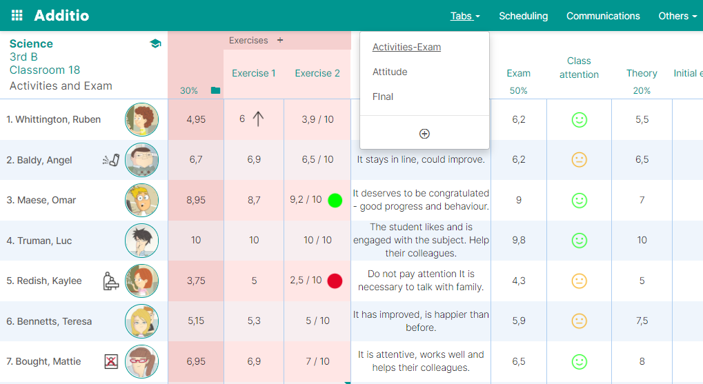
You will see that the design also changes within the class group, with a larger visualisation of the gradebook and thousands of new features that will make it easier for you to assess your students. So that you can get the most out of this new version, let’s take a look at the main changes we can see now.
THE NEW ORGANIZATION WITH TABS
At first glance, we can see that the tab options on the right side of the tab have disappeared. Now you can find the same options distributed in two buttons:
On the top bar of the screen you will find the tabs section, where you can see the tabs you already have applied in the class group and also create new ones from the + icon.

You will see that from now on, in order to modify the information inside a tab, you will be able to do so using the pencil icon that appears in the top right-hand corner of the screen. From this icon you can delete the tab, change its name, hide it, or even create a tab with quick columns:

As for the other functionalities such as attendance, annotations, calendar and resources, you can find them in the circle icon at the bottom of the screen.
Finally, you will now be able to quickly find the scheduling section from the “scheduling” section above the notebook, which is located next to the “tabs” option.


